Mid-Atlantic Resource Services
Two hearts that form an M, for a care provider built on compassion
- Role
- Lead Designer (freelance)
- Scope
- Logo, Branding, Website
- Delivered
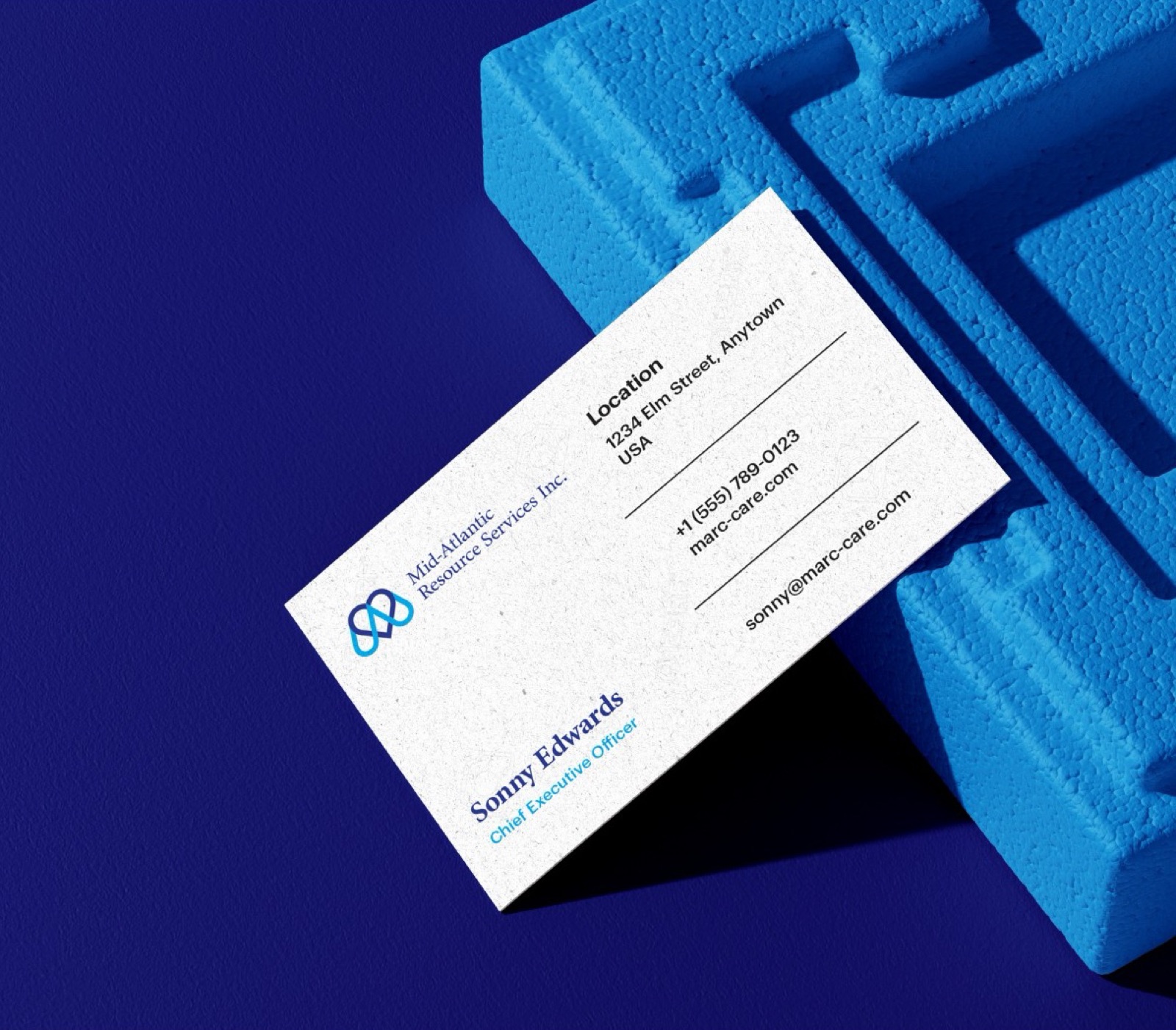
- Logo system, Brand guide, Business cards, Letterhead +4 more
- Result
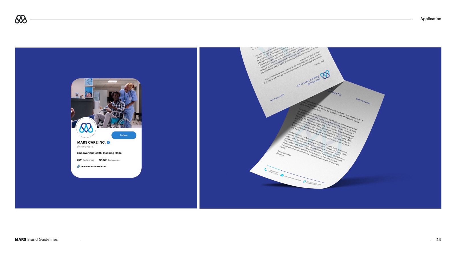
- Print, stationery and the website now share one look
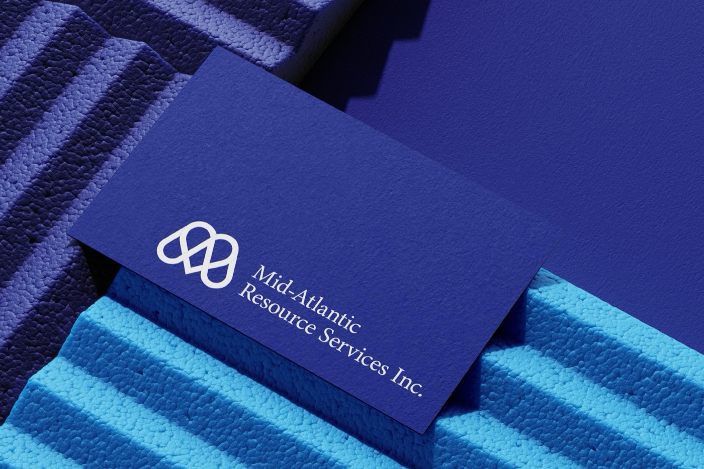
Mid-Atlantic Resource Services, known as MARS and through its care brand Marc-Care, gives home-based and community care to people with intellectual and developmental disabilities from Stevensville, Maryland.
What was on the plate
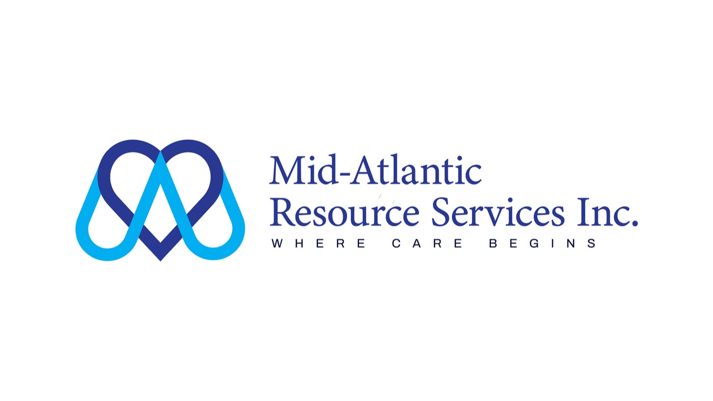
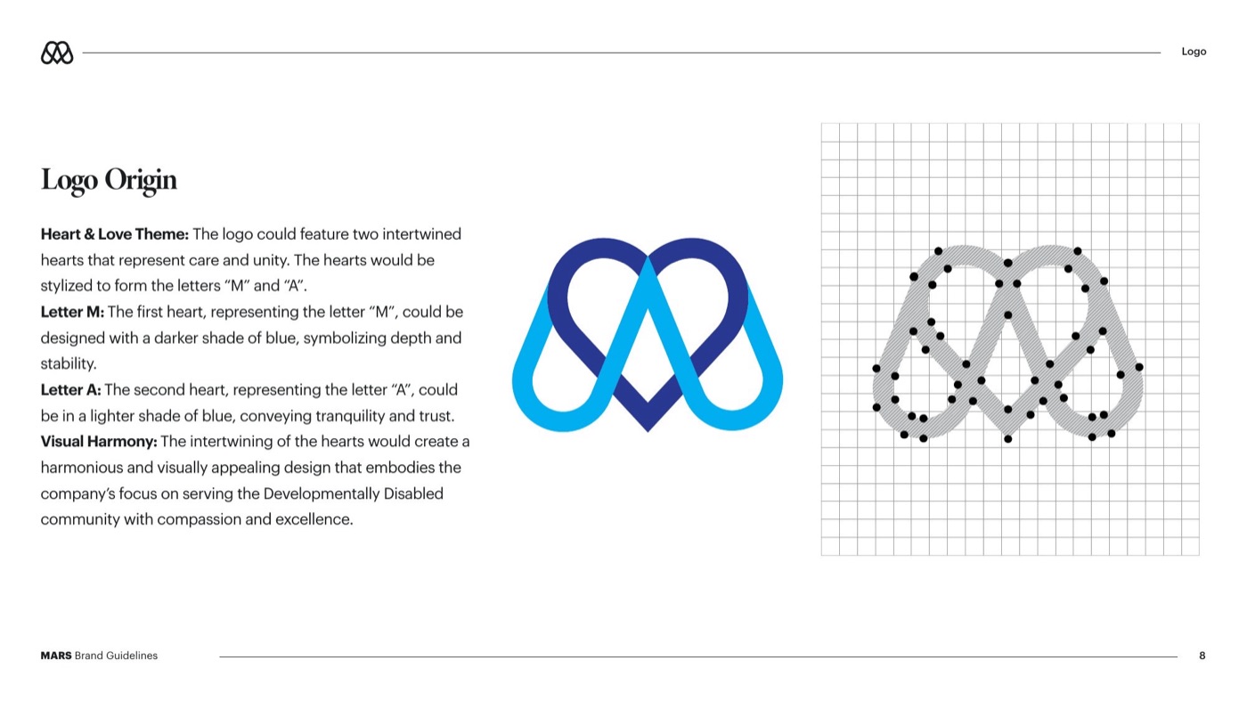
The mark says that in one shape. Two hearts overlap: the darker one forms an M, the lighter one an A. Together they read as care given and care received, and the tagline finishes the thought: Where care begins.
- A care provider with seven services and no brand to hold them together
- Two names to reconcile, Mid-Atlantic Resource Services and Marc-Care
- Families and referrers who needed to understand the services quickly
- Print and stationery for a team working out in the community
How I solved it
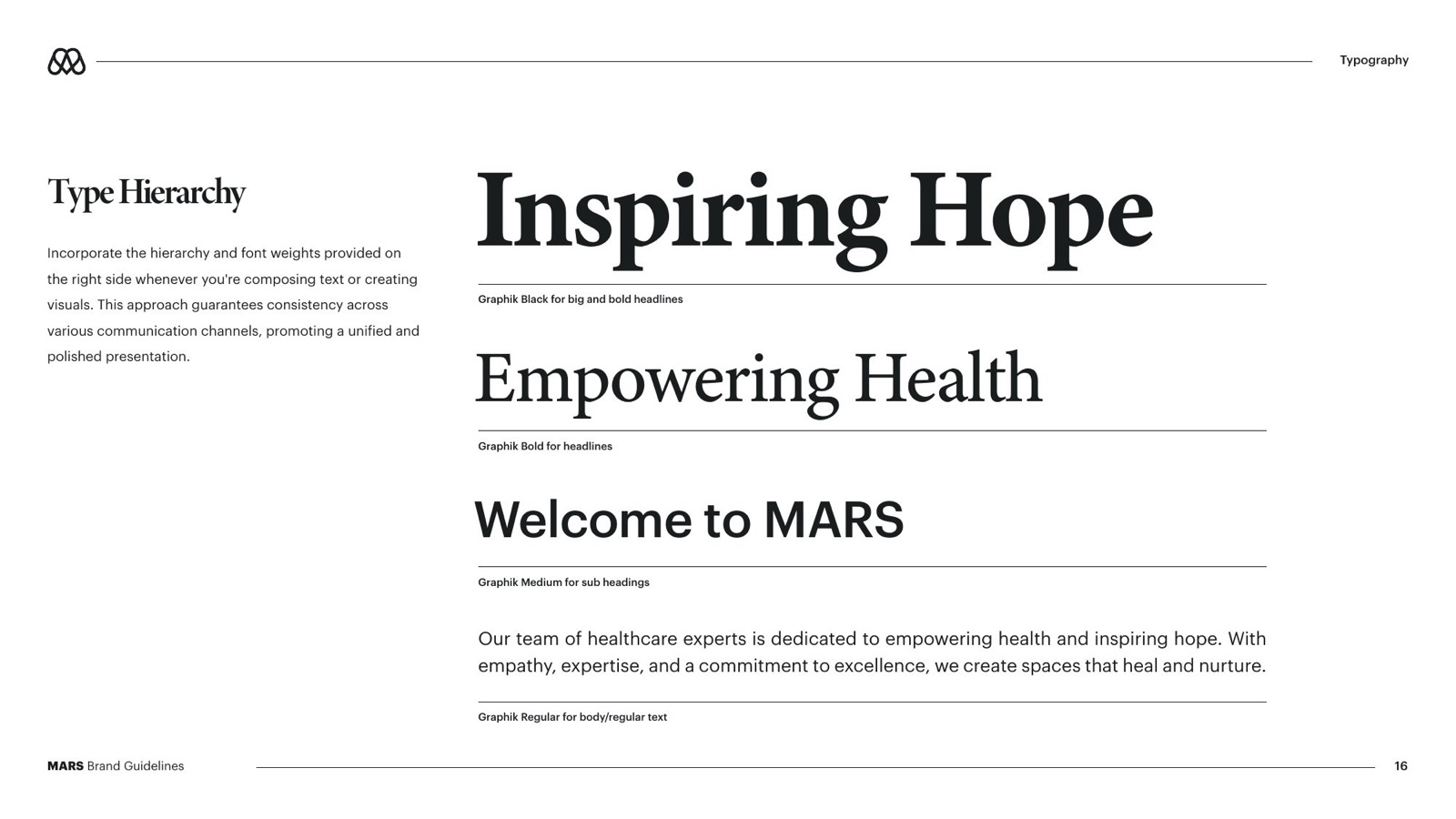
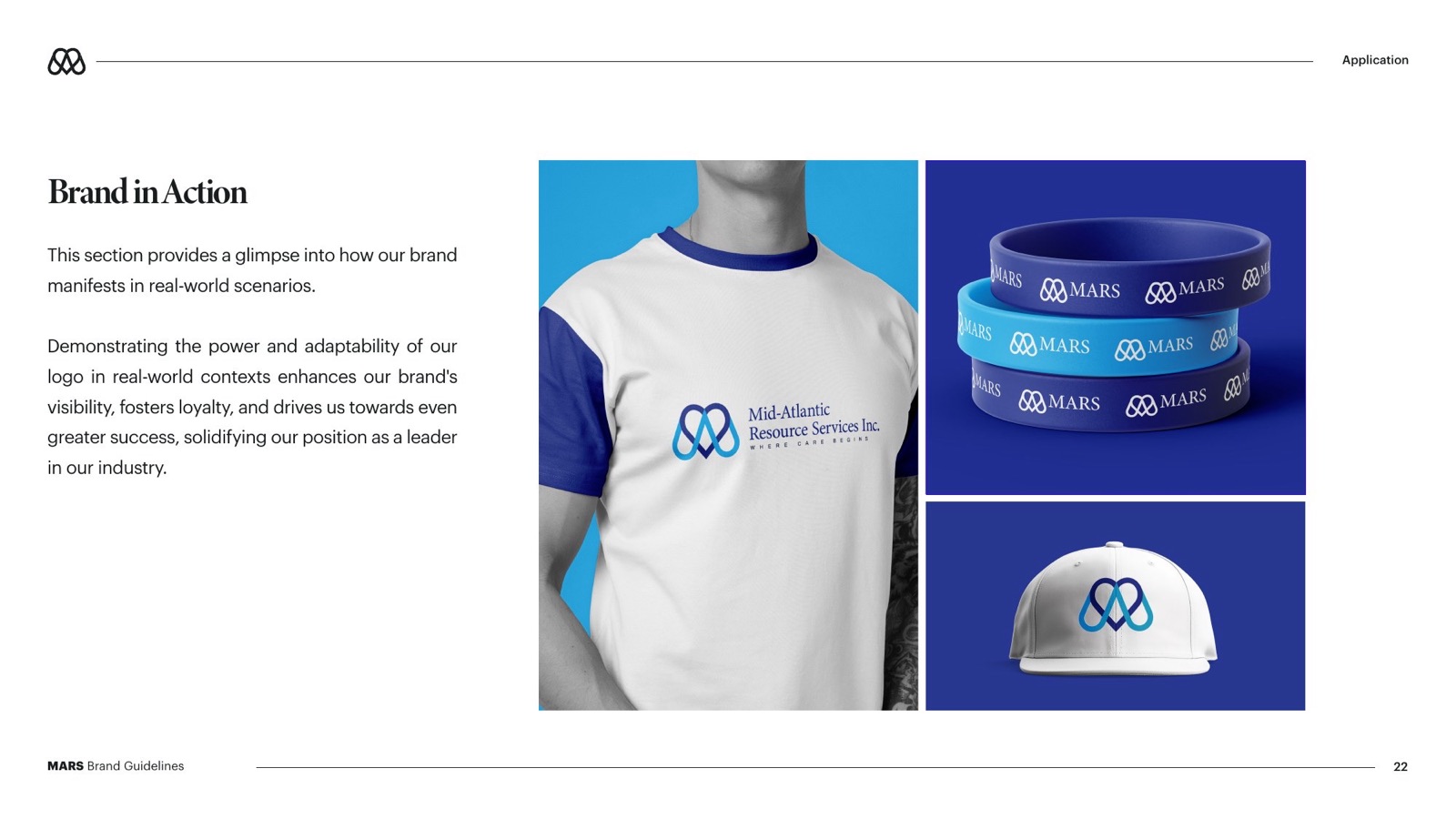
Around it I set a calm, trustworthy system: a classic serif for warmth, Graphik for clarity, and two blues that feel medical without feeling cold. The brand guide sets the rules, and the stationery, merch and a services flyer put them to work.
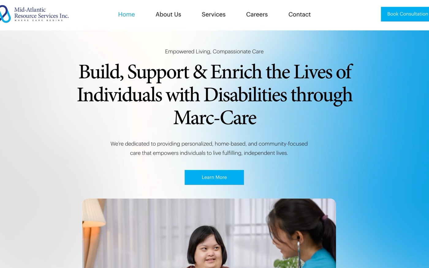
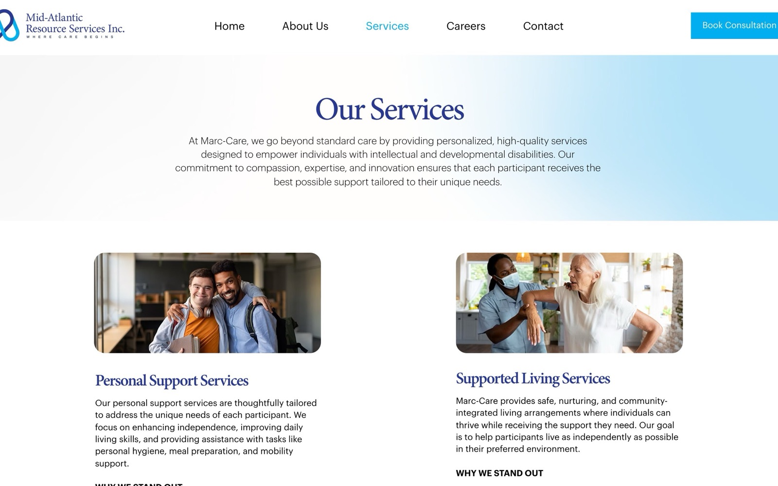
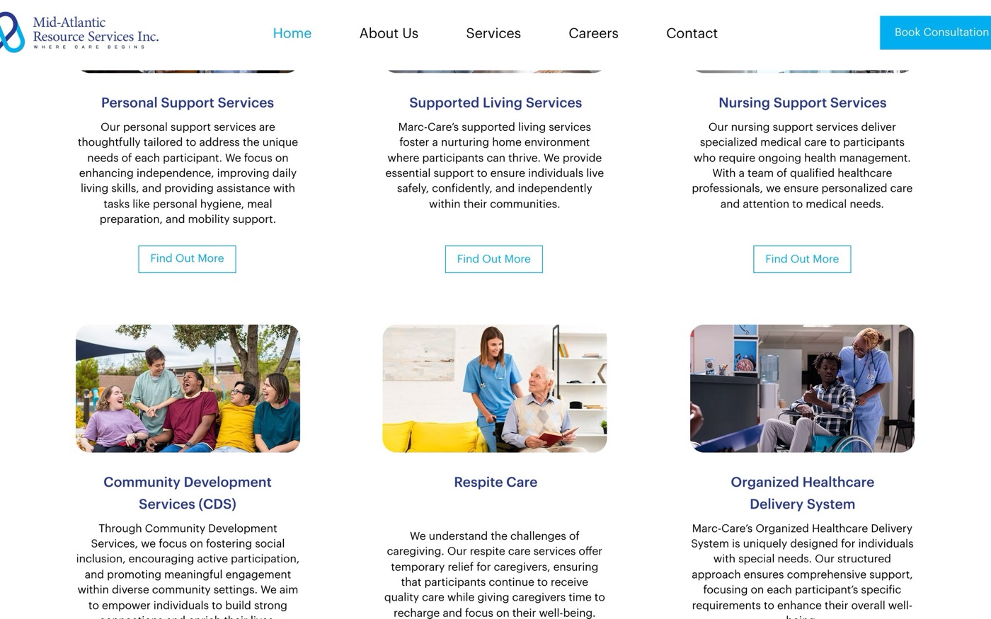
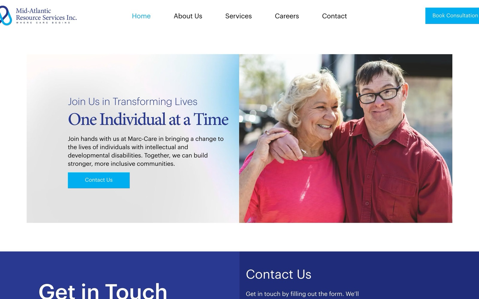
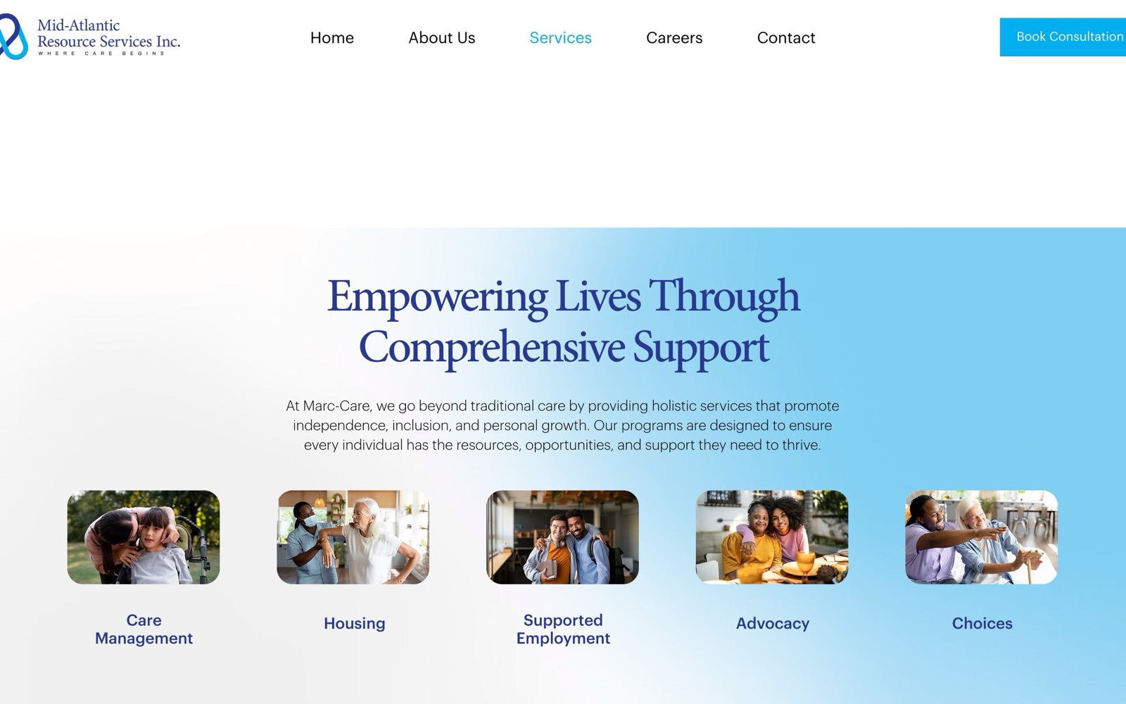
marc-care.com explains all seven services in plain language, from personal support and nursing to respite care and the community living group home, with a clear route to book a consultation.
- 01A mark made of two intertwined hearts that form the letters M and A
- 02A 25-page brand guide with logo rules, a classic serif and Graphik type, colours and applications
- 03Business cards, letterhead, shirts, caps and wristbands
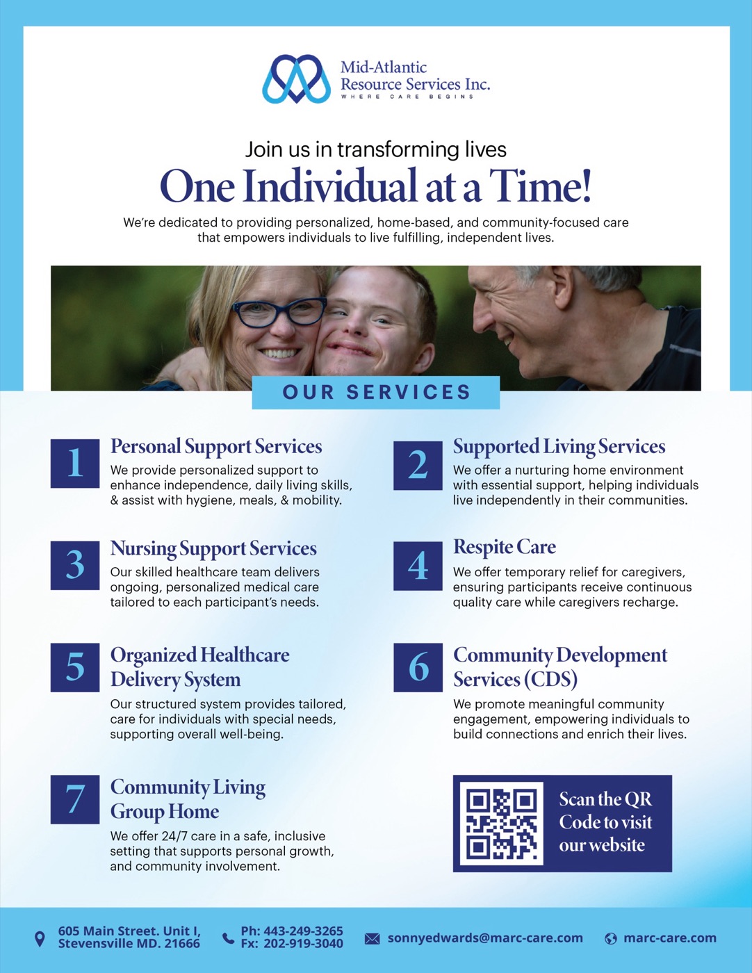
- 04A services flyer with a QR code to the website
- 05marc-care.com, with home, about, services, careers and contact pages
What changed
- Print, stationery and the website now share one look
- Every service is explained in one place, with a clear way to book a consultation